

Custom charts for Jira are not just fancy graphics; they serve a crucial role in project management and resource planning. They provide a visual representation of complex data, making it easier for stakeholders to grasp the project's progress, bottlenecks, and overall health.
Companies rely on tools like Jira to streamline their projects, and while Jira is undoubtedly a powerful platform, its default reporting capabilities can sometimes fall short of providing the visual insights needed for informed decision-making. That's where custom charts for Jira come into play, offering a solution to enhance project management through compelling visuals.
Using Jira Dashboards for Custom Charts
Custom Charts for Jira offers a myriad of possibilities, ranging from simple bar charts to intricate heatmaps. They enable you to visualize your project data in a way that makes the most sense to you and your team. Whether it's tracking sprint progress or monitoring issue statuses, you can create charts that provide instant insights.
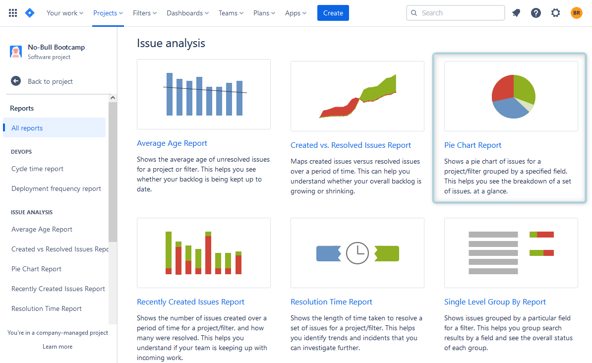
Some charts are presented in the Jira reporting section:
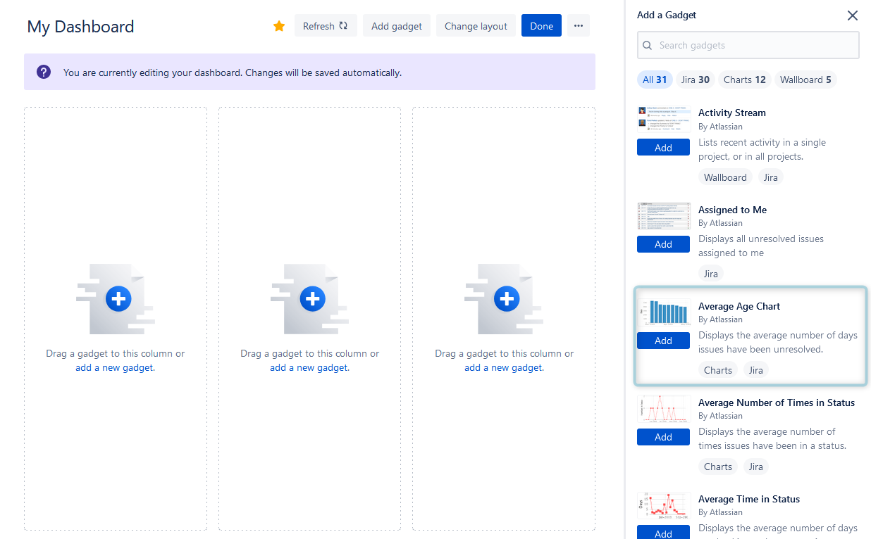
But most can be added to Jira dashboards. You can find various chart types, available for the Jira dashboard, like pie chart, grouped bar chart, multi-line chart, cumulative flow diagrams, and others. You have the flexibility to choose the one that suits your data best.
Some experienced Jira users can create advanced custom charts with the help of the JQL (Jira query language). Those who want to try other charts than they can find in Jira Dashboard can try add-ons for Jira, that provide various custom templates.
For example, they can take a look at the ActivityTimeline tool for Jira. Users can find it in the Atlassian Marketplace, and it's available for Jira Cloud/ Jira Data Center.
Create Jira Custom Charts with ActivityTimeline
So, ActivityTimeline for Jira is a resource planning and tracking tool, that helps to manage teams, individuals, and non-human resources. All Jira data is fully synchronized with the tool and vice versa, so you always get real-time updates on the users' and projects' success.
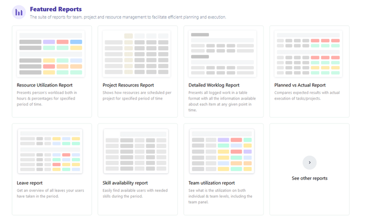
ActivityTimeline offers users dozens of resource and project Jira reports:
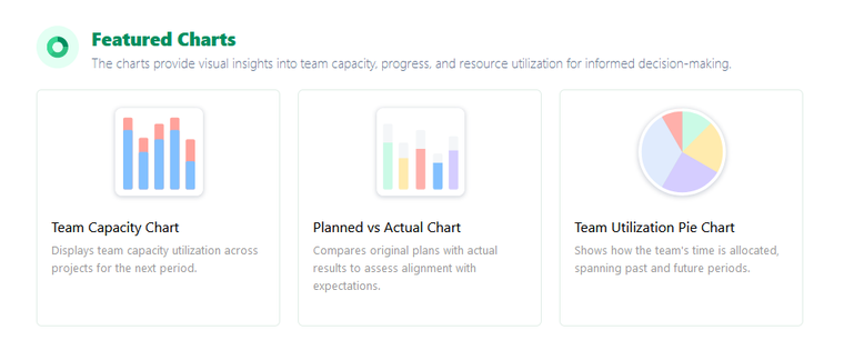
Execpt these reports, users can also find templates of custom Jira charts:
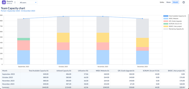
The Team Capacity Chart is a powerful visual tool designed to help managers and team leaders understand the workload and availability of their teams over a specific period.
It provides a clear, concise picture of how a team’s available capacity is allocated and utilized, making it easier for teams to plan and manage their projects effectively.
Key Components of the Team Capacity Chart
1 Component: Total Available Capacity
This is a sum of the individual capacities of members of the team, considering all their non-working activities (e.g. days off, holidays, etc.) and overtime.
2 Component: Utilized Capacity
This is a sum of all the assigned workload on users from this team, which is based on the remaining estimate from Jira tasks, Bookings, Placeholders, and imported Calendar Events.
3 Component: Remaining Capacity
This value shows the difference between the total available capacity & what’s already planned (utilized capacity).
4 Component: Utilization
Displays in the % format, how much of the team’s capacity has been already planned for the period.
Team Capacity Chart: Explanation
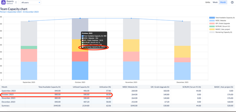
We can see that for the month of October, we only utilized around 2/3 of the capacity (580.8h) of the team of 880 hours, meaning that we still have almost 300 hours for this team available for additional work.
Our recommendation is to target at least 90% utilization of the team to ensure maximum productivity.
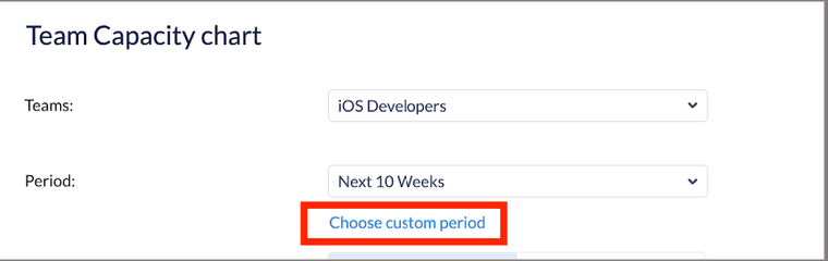
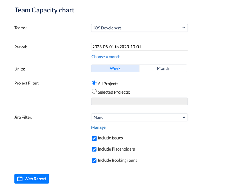
Chart Configurations
Let’s dive a little bit deeper into the chart configurations to understand the chart capabilities better:
- Teams - You can only generate this chart for 1 team at a time
- Period - You can choose either a pre-selected period or a custom one for the report:
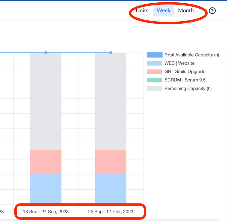
- Units - You can aggregate the data into weeks or months:
- Project Filter - By default the chart is generated for all the projects the team is working on, but you can filter for specific projects.
- Jira filter - Instead of filtering by projects, you may generate the report per saved Jira filter based on JQL.
- Include/Exclude Jira issues/Placeholders/Bookings - By default, all items with estimates are included in the chart but you can exclude them from the report generation.
Conclusion
Custom charts for Jira offer a remarkable way to enhance project management by providing clear, visual insights into project data. Users can add charts to the Jira dashboard, and find them in Jira reports or in special add-ons for Jira like ActivityTimeline.
With the ability to choose from various chart types and customization options, teams can tailor their charts to suit their specific needs, ultimately improving collaboration, decision-making, and project outcomes.


