Team utilization refers to the efficient allocation and utilization of resources within a team to achieve organizational goals. It is crucial for project success and overall organizational efficiency and ensures that resources are allocated optimally, tasks are distributed evenly, and bottlenecks are identified and addressed promptly.
With the right tools, you can observe your resources' workload and utilization effortlessly. Here's where the Jira Pie Chart Report comes in handy.
Reports and Charts in Jira
Reports and Charts in Jira offer visual representations of project data, enabling stakeholders to gain valuable insights at a glance. From burndown charts tracking sprint progress to pie charts showcasing issue distribution, these tools empower teams to make data-driven decisions and identify areas for improvement.
Users can locate them within Jira Reports or integrate them into the Jira Dashboards. Let's observe a couple of categories of pie charts in Jira.
Workload Pie Chart Report
This chart report aggregates data from Jira tasks, categorizing them based on assignees and status. You can create a pie chart with just a few clicks. Interactive filters enable users to customize the report according to specific criteria such as original estimate, current estimate, or time spent.

Users can also simply add a Workload Pie Chart Gadget to their Jira dashboards.

Pie Chart Report
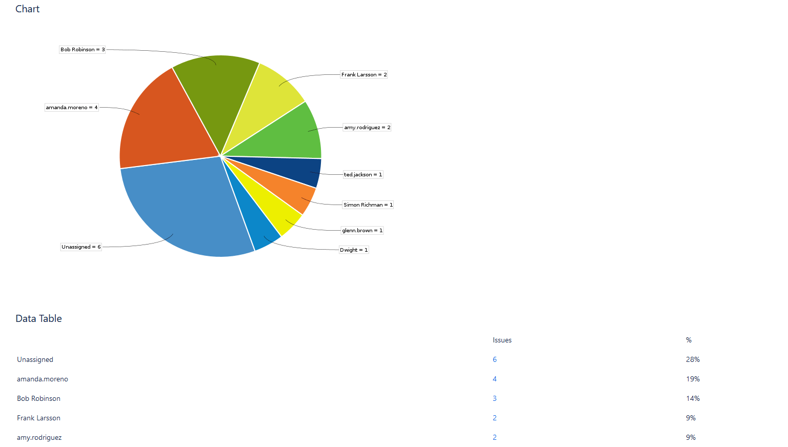
Among other Jira custom charts, we can name a Pie Chart Report. The report exhibits project or filter issues, sorted by a selected criterion. This functionality offers a rapid glimpse into issue distribution, improving clarity and comprehension.
Jira users who want to discover more efficient reports and advanced charts can try Jira plugins, such as ActivityTimeline, available in the Atlassian Marketplace for Cloud/Data Center.
ActivityTimeline Resource Reports
ActivityTimeline is a resource management and tracking tool, that offers resource capacity planning features, timesheets, and numerous comprehensive reports.
There are several chart reports presented in the app. Today we'll focus on the Team Utilization Chart.

Team Utilization Pie Chart: Key Points
It's very easy to understand team utilization with this pie chart. It provides insights into the distribution of resources across multiple projects, allowing managers to identify bottlenecks, optimize resource allocation, and make sure that every project is on track. With its intuitive interface and customizable parameters, the chart offers a holistic view of project dynamics, empowering teams to make informed decisions and drive productivity.
Featuring capabilities to examine both historical and future data, this chart assists managers and teams in reviewing past allocations and strategizing for forthcoming tasks with efficiency.

The color-coded visualization enhances readability, making it easy to identify resource distribution patterns at a glance.
The chart comprises two primary elements:
- Past Time Allocation: This segment illustrates the team's time distribution across various projects during a completed period, utilizing logged work hours, bookings, and imported calendar events.
- Future Time Allocation: This portion forecasts the team's time allocation for an upcoming period, based on estimates, bookings, placeholders, and imported calendar events.

This report shows team time allocation for the future period.
For the reported period, this team is scheduled for 34 hours, from which almost 58% will be spent on the A Project, making it by far the most important project of this team.
Let's explore the chart setup choices:

- Reporting Scope: This setting decides whether to utilize Worklogs (Past) or Estimates (Future) for calculations.
- Team Selection: Choose the team whose time distribution you wish to view.
- Period Selection: Toggle between predefined periods for the past or future, or opt for a flexible period.
- Detailing Options: Aggregate data by Jira project or epic.

You can also include a Jira Saved Filter in the report.
Conclusion
Reports and Charts in Jira are invaluable tools for modern project management, offering insights, transparency, and agility to teams across industries. ActivityTimeline's Team Utilization Pie Chart offers a valuable visual representation of team workloads, benefiting both Project Managers and stakeholders.
By integrating appropriate tools and reports into your workflow, you can optimize your team's performance, propelling your organization toward success.